Goals
The old site looked very outdated and even more importantly was very difficult and frustrating to navigate: some links were broken, the navigation was inconsistent, the font size amazingly small. Also, they wanted to offer a better online payment to enroll the children, that would be logical and easy. The administrator were looking for an easier way to update and change information on a whim.
Solution
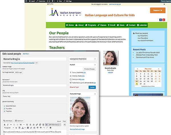
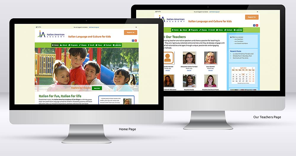
I chose Wordpress to provide the customization that was needed but without sacrificing simplicity. I created a very highly customized theme, with all the necessary options, including custom posts types, calendars, e-commerce and custom posts archives. The response was overwhelmingly positive: the parents loved how easy it was to sign up, enroll and pay, and the administrators were really amazed at how simple it was to update information, or even add new classes.
Wireframes
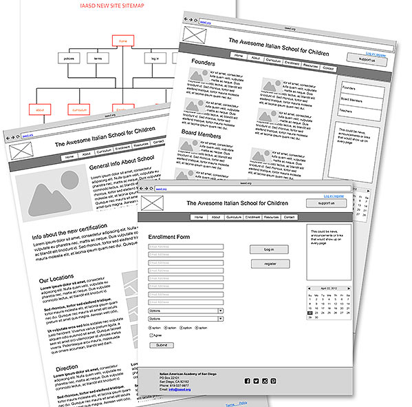
The first step was to create a new flow for the site: I simplified and reorganized the navigation, I streamlined the registration process and I move content in logical sections. The new site was represented as a wireframe.
Style Tiles
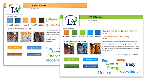
Once the site structure was approved, I created some mood boards which included color palettes, image styles and typefaces.
Design
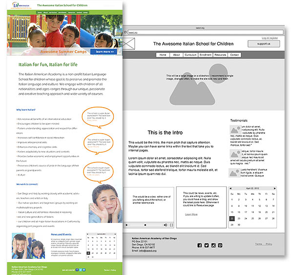
The client required a few interface designs, to see how the styles would have been applied to the whole site, so a few Photoshop comps were presented.
Build
The site went in production. A new theme was created and the customization added. The e-commerce section was tested and deployed. The site launched in time for the new enrollment season.
Responsive Design
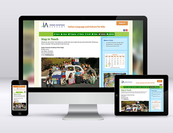
While the original requirement was to create a desktop version of the site, it become obvious that many parents would appreciate a well thought out mobile version. The responsive version of the site should be live by Summer 2017.
Result
Contact me
Chiama
Do you want to know more? Are you intrigued? Contact me: I love to meet new people. If you need a new site, or a consultation, maybe some private lessons, or an incredible hand-made cappuccino, I am here to help.
Let's get a coffee
If you are in the San Diego area, stop by and say CIAO! We can talk about your new project with nice cup of java, or in front of an ice cream, whatever you prefer.